Gain Sans — A sophisticated, sharp, and neutral grotesque
Gain Sans — A sophisticated,
sharp, and neutral grotesque
Gain Sans —
A sophisticated, sharp, and neutral grotesque
Gain Sans — A sophisticated,
sharp, and neutral grotesque
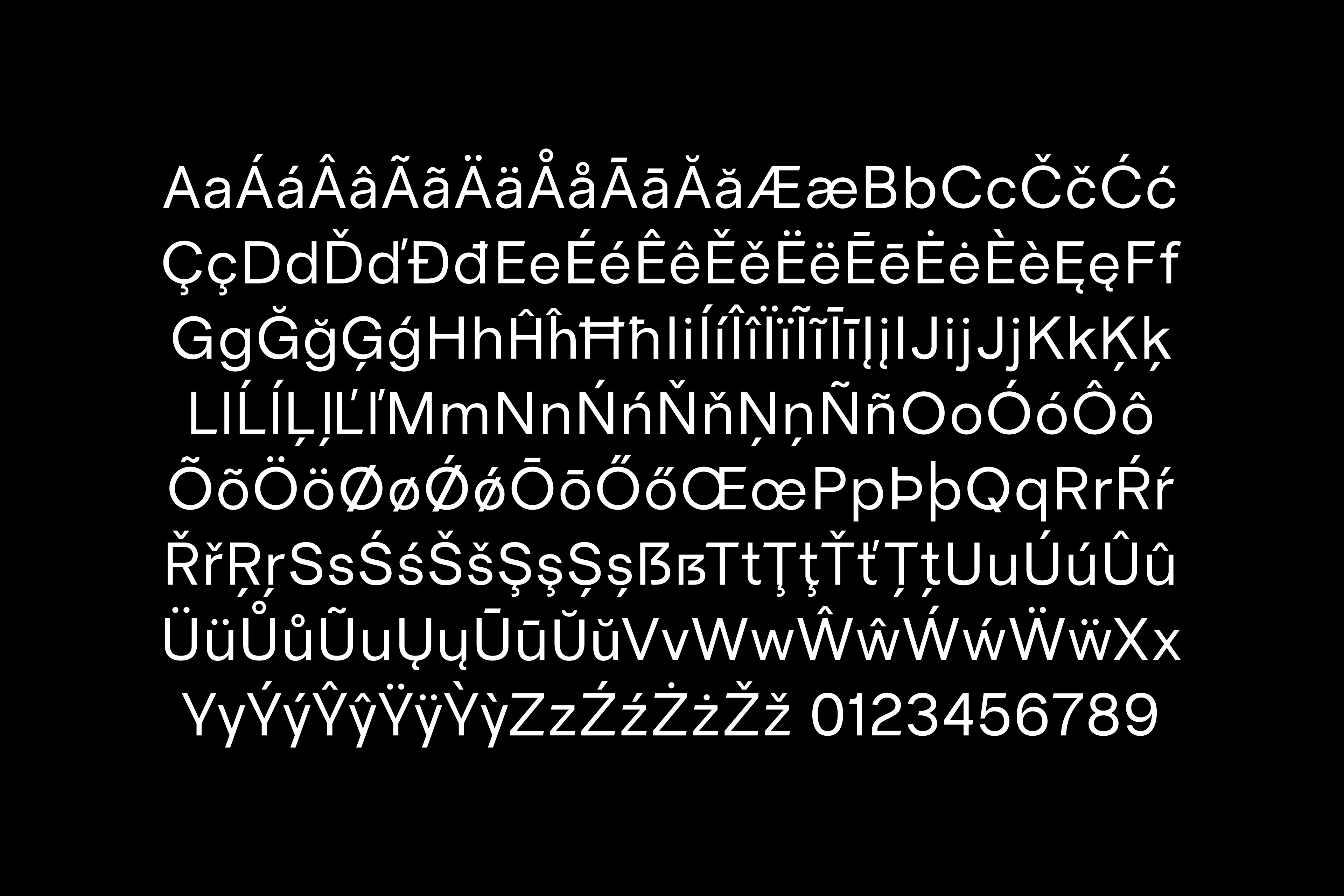
Background
I developed Gain Sans out of my love for Swiss typography, also to have a solid grotesque with every character, proportion, and style that I look for in a sans serif. The goal was to create a universal and neutral typeface that has a contemporary feel, with subtle details that give it personality in large sizes. Gain was designed to be a default choice when in need of a sans serif that performs consistently and conveys a professional, sophisticated feeling.
The Regular cut is available for purchase. The variable version is currently in development.
Category
Type Design
Credits
Design:
Adam Pusztai
Consultants:
Natalia Tímea Szabó, Zeman Zoltán
Links